KEYWORDS
UX Case Study. Dashboard Design. UX Heuristics.
TIMELINE
September, 2023
VERSION
v22.5
HealthifyMe assists individuals in managing their calorie intake, workout routines, and facilitates their journey towards achieving fitness goals.
In this project, my objective is to rectify the issues by designing an intuitive dashboard that can be understood at a glance, thus also enhancing the initial user experience.
Problem Statement
The current homepage falls short in providing a user-friendly interaction and easily comprehensible holistic view of one's data.
It is time consuming for a new user to understand the insight and analyze their next move.
SOLUTION
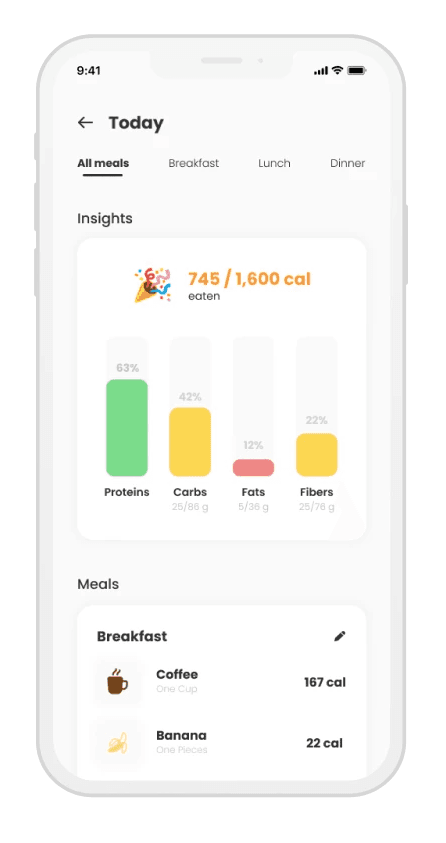
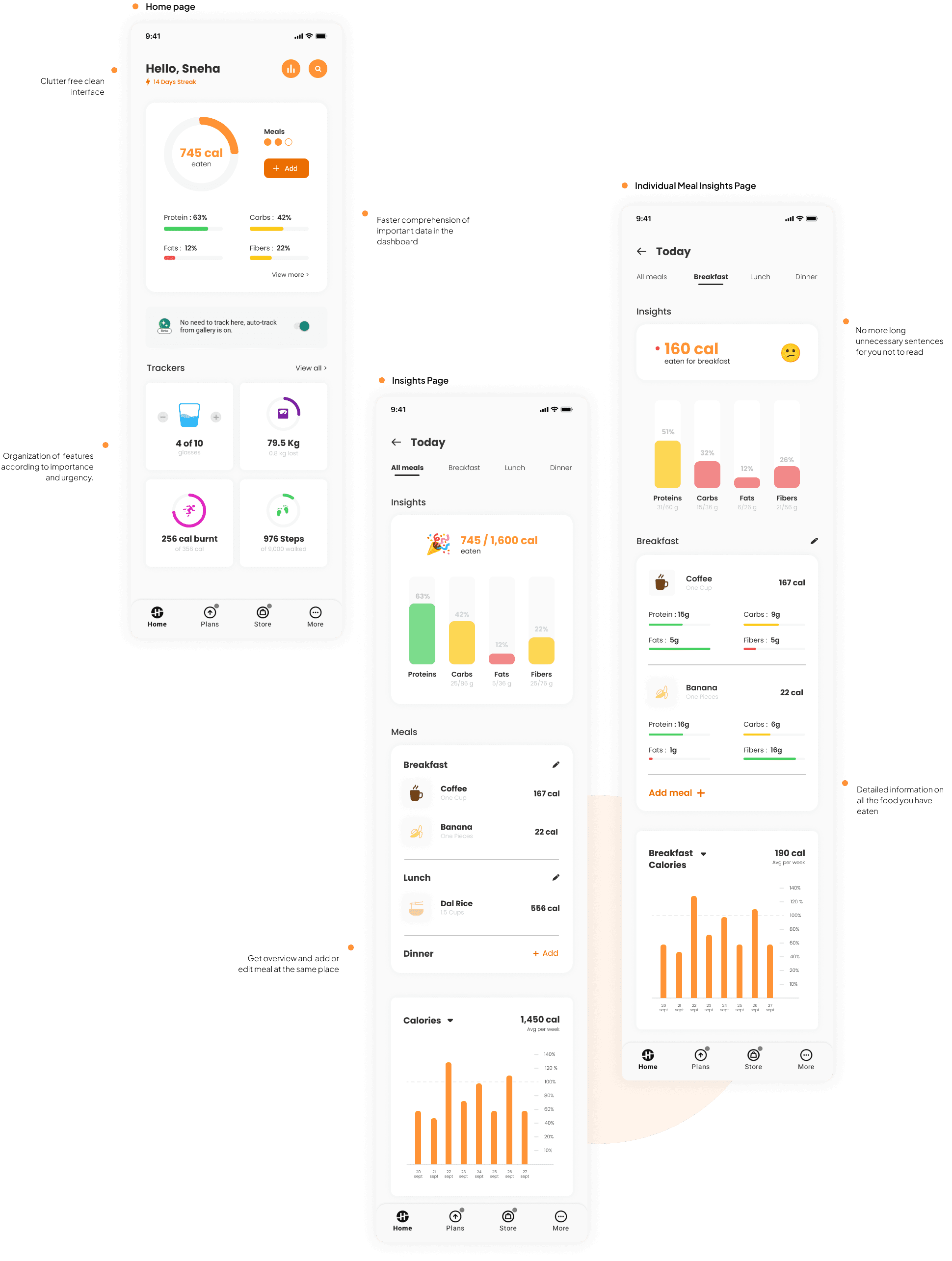
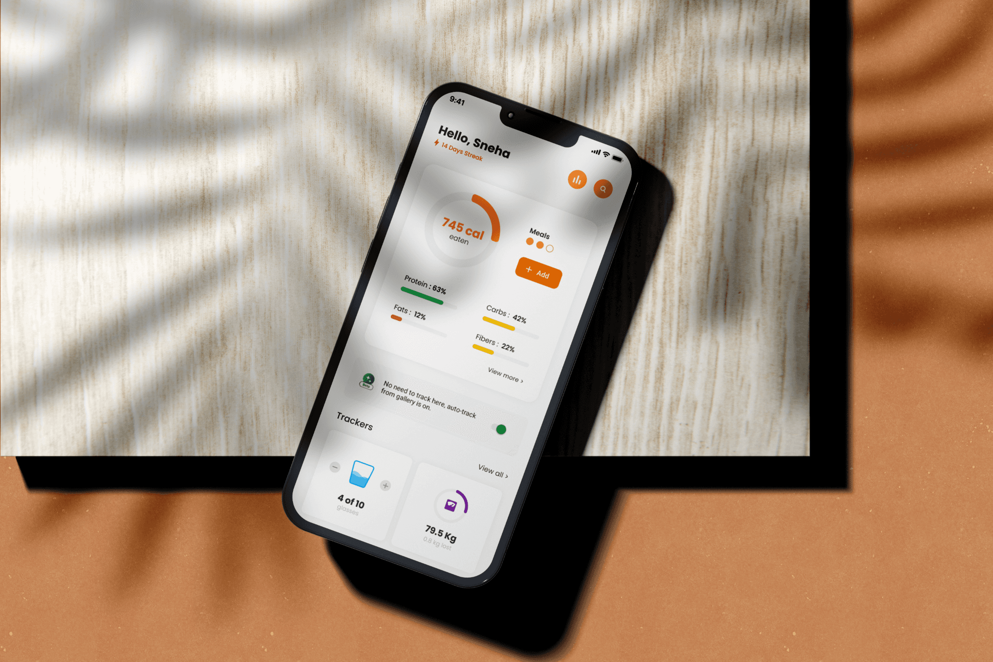
The homepage and insights redesign with the aim to create an intuitive dashboard for faster user comprehension.
This redesign will prioritize reducing clutter and organizing elements logically and systematically in the interface. By streamlining the user experience, we can enhance the overall usability of HealthifyMe.
About the brand
SECONDARY RESEARCH
Even though people have a relatively high consciousness of healthy dietary concepts, they lack the discipline to stick to the diet.
The primary reasons for adopting a healthy diet are for fitness, awareness, lifestyle purposes and some due to medical reasons also. They also want to have more healthy choices, to look and to feel better.
About 85% inaccurately assess their diet quality. Amongst which most of them overrated the healthfulness of their diet. (Source: Nutrition.org)
Eating healthier, becoming fitter and thin was three top New Year’s resolutions for up to 52% of the people. (Source: Statista)
Nearly 36% of smartphone owners had an Health app, using it for achieving health-behavior goals (60%), medical decision-making (35%), or using it to communicate with healthcare providers (38%).(Source: Translational Behavioral Medicine).
INTERVIEW
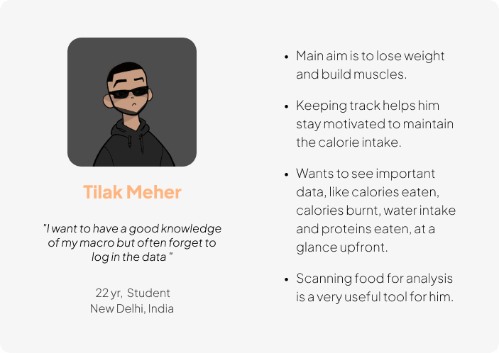
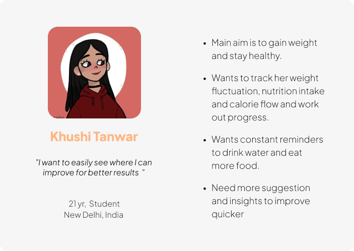
I spoke to people who have been users of the app, who have used other health tracker app and who aim to lose weight and become fit.
The aim was to understand their needs and goals, what they want to track and their frustrations with the current process of tracking.
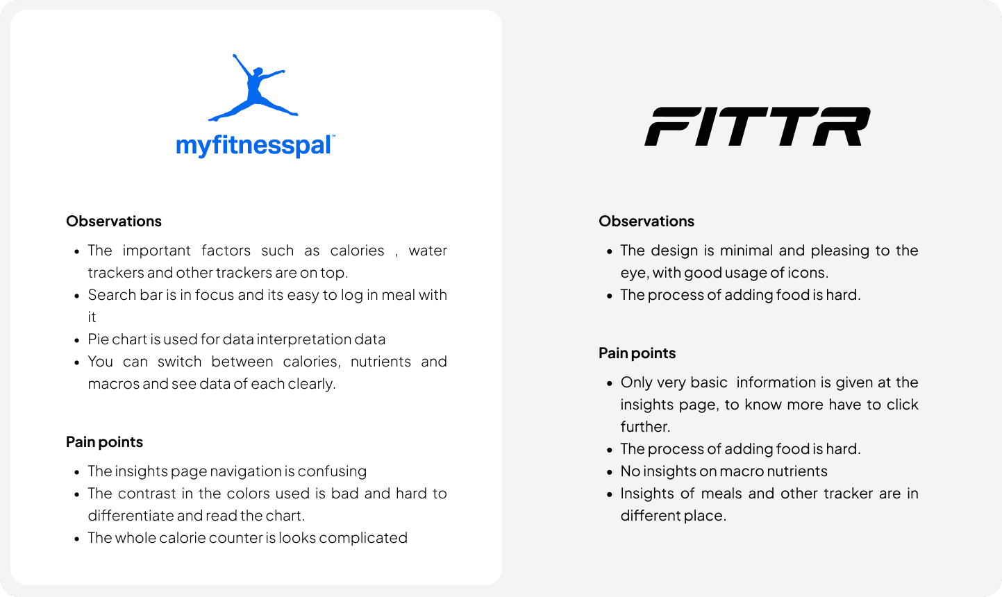
COMPETITIVE ANALYSIS
I analyzed several popular Health and nutrition apps to overstand what is already out there and how I can learn form it and improve it.
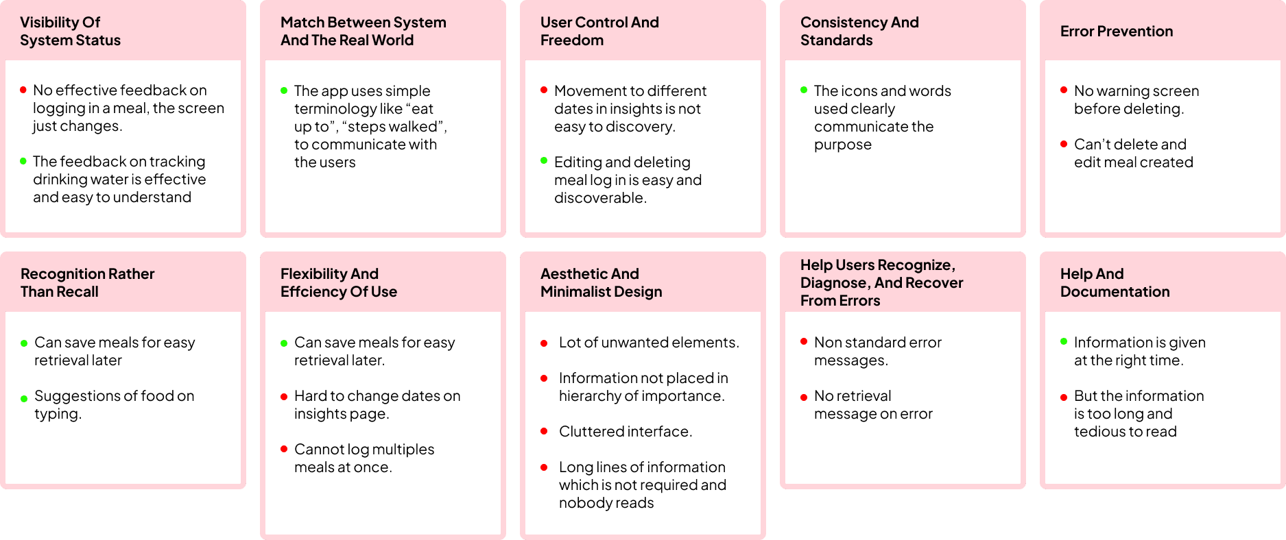
Ux Heuristics analysis
Jakob’s Usability Heuristics was used to identify any usability design issues associated with the user interface.
Ux Heuristics analysis
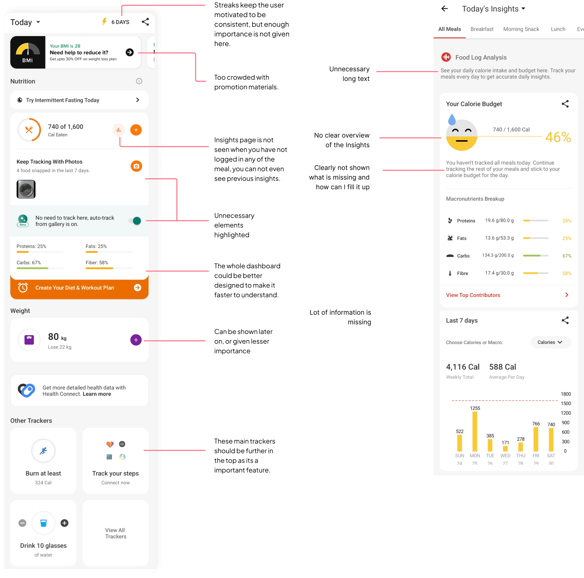
I have been using the app for an extended period, during which I've taken note of my observations from the perspective of both a first-time user and a long-time user.
I noticed several significant issues, including:
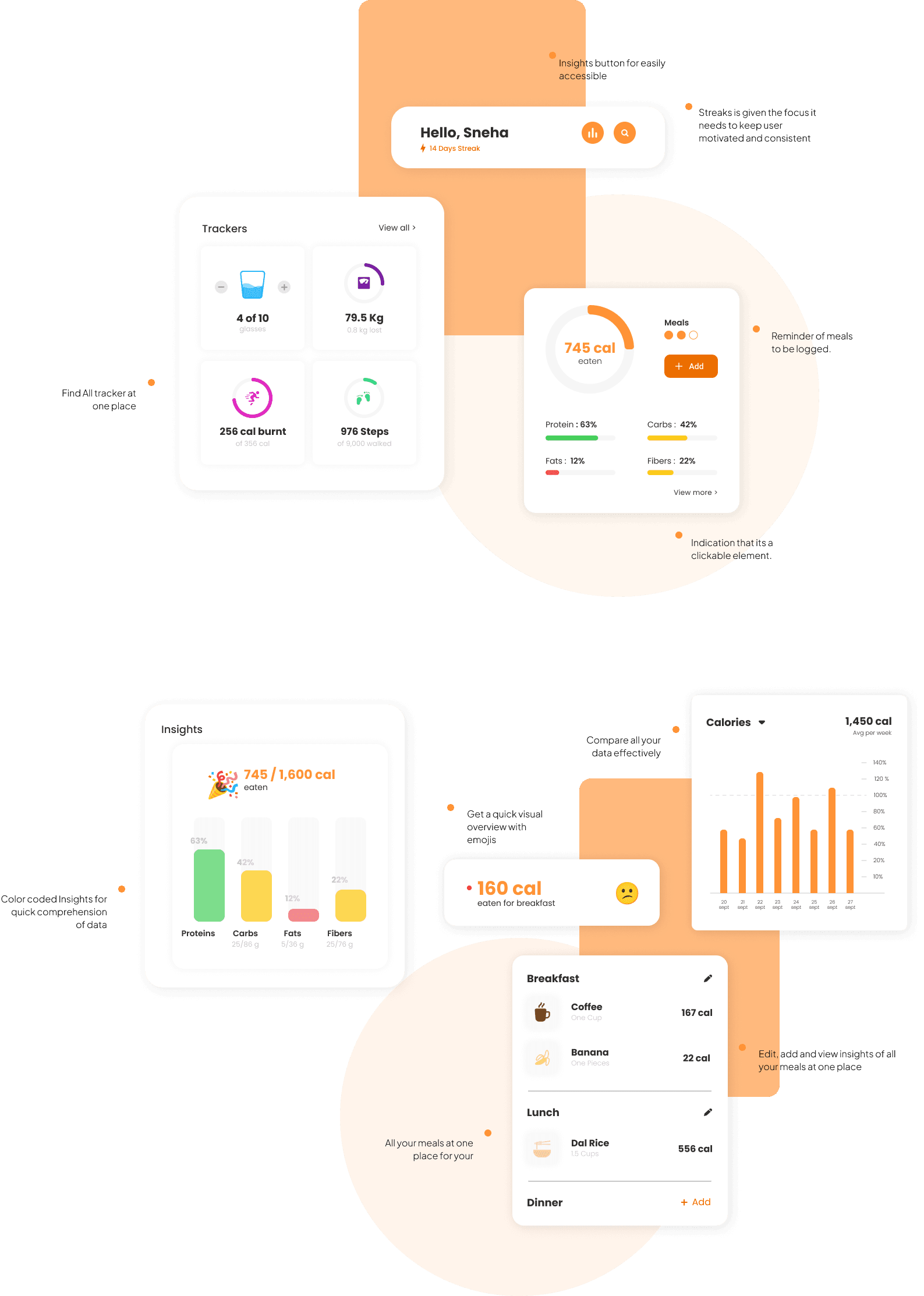
No indication that the whole dashboard is clickable.
The app lacks the capability to add multiple meals at once, which would be a valuable feature.There is an excessive amount of clutter, including unnecessary text and elements that contribute to a cluttered interface.
First time users might get lost after seeing a lot more options popping from the home screen.
Lot of information is missing in the insights page, overview of meals.
We can’t see any insights if we have not logged any food that day.
Overview of what user has eaten whole day and its nutrition values can be in the same page, but its on different pages.
helpful features in the app
Few users in my interview find the usage of emojis in insights very useful and easy to understand.
Effective feedback in water tracker
Simple useful design of all trackers.
Good usage of icons
TARGET AUDIENCE
16 to 40 year old's are the primary users of nutrition monitoring apps.
User needs
A holistic view of the main data to see at a glance.
Easy comprehension of one’s insights.
Constant motivation and reminder to maintain consistence.
Simplifying the meal logging flow.
Customization according to their goals, schedule and eating habits.
Effective feedback.
Reduction in irritating ads and needless information which degrades the overall experience.
BRAINSTROMING
Keeping all the insights I got in my research and inspirations in mind, I brainstormed few ways of making the experience better.
Gamify the app by giving importance to streaks to make the user more consistent in logging in their meal and maintaining a diet.
Systematically arrange the elements in the homepage depending on the importance and urgency of the feature.
Use graphs to make the data easier and faster to comprehend.
The dashboard should show information according to the goals of the user.
Can add feature of where time of meal eaten and water drank also is also monitored as it is considered a important factor in maintaining a diet.
Add a friendly salutation, a character of them to make it personal and welcoming.
WIREFRAME
I implemented the brainstorm ideas to assess their effectiveness in terms of usability, accessibility, and the hierarchical arrangement of interface elements. This hands-on approach allowed for practical evaluation and refinement of the design
USER TESTING INSIGHTS
What can be improved
Streaks being in the center is diminishing the focus on the main aim of the app.
Don’t need to repeat every information seen in the dashboard in insights.
FINAL DESIGNS
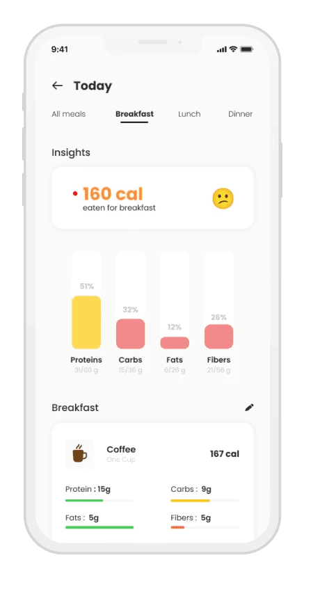
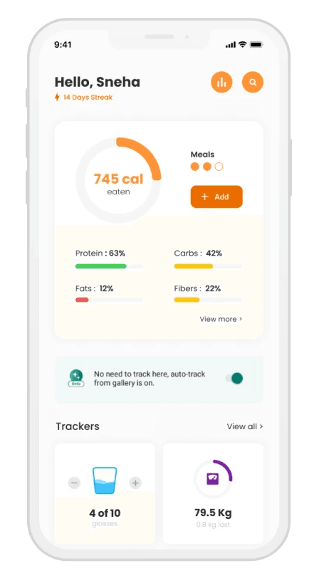
The knowledge obtained from evaluating my medium-fidelity prototypes with a chosen set of users and getting input from other designers was crucial in fine-tuning the interface design to its best condition.
In my final design proposal, I've have tried to address the issues discovered during the research. I achieved this in a manner that is both efficient and consistent with the brand's guidelines. Furthermore, I ensured that the elements of the interface that were already user-friendly and valuable remained the same.
