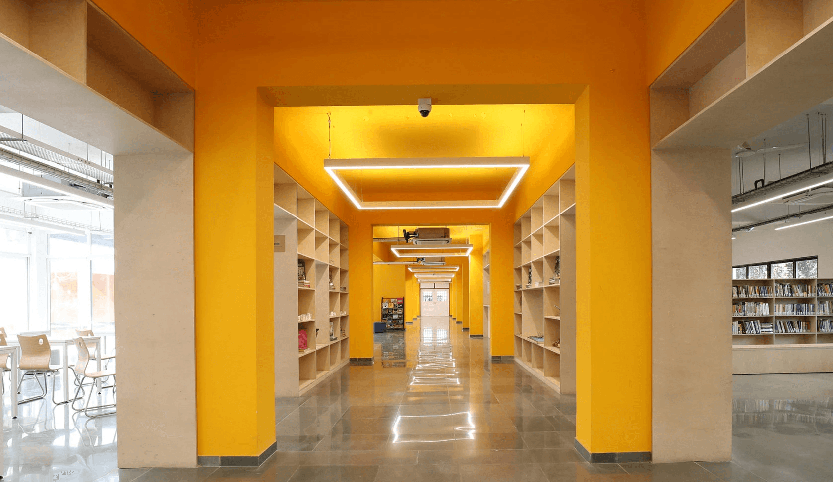
Library Kiosk

Redesign

Library Kiosk

Redesign

Library Kiosk

Redesign

Library Kiosk

Redesign

KEYWORDS

Human Factor Design. Kiosk Interface. Product Design.

TIMELINE

Jan 2022 - March 2022

Team

Akshatha Bhat. Khushi Tanwar. Prathamesh Shetye. Ikram Kazi. Sneha Birur

The Celect Self-Check Kiosk, presently utilized at Anant National University's Library, serves students and faculty in handling most significant book transactions.

This project strives to make the kiosk user-friendly for both new and experienced users while also improving its features to streamline tasks and reduce errors.

Problem Statement

The first-time user experience with the kiosk interface is challenging, posing difficulties for new users in terms of navigation and comprehension. Additionally, the physical components of the system present maintenance challenges for librarians, and its bulkiness makes it less space-efficient.

ABOUT THE PRODUCT

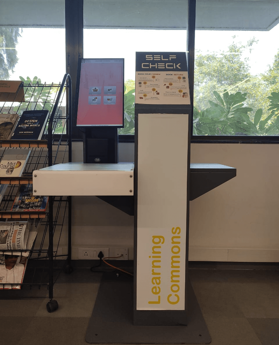
The Celect Self Check Kiosk has a large 22" touchscreen with 16:9 Aspect Ratio. It is a clear touch screen device with a fast slip printer integrated with library circulation system. It has got the features of checkout, check-in, renew & account related features required in the self check system.
understanding the product

The Metal Body

Portrait touch screen interface with a RFID Scanner.


Location

  • Placed at the checkout point at the beginning of the library.

  • Well-lit background, near the window.

  • A lot of glare from the tube light on the ceiling.

The Metal Body

Portrait touch screen interface with a RFID Scanner.


Location

  • Placed at the checkout point at the beginning of the library.

  • Well-lit background, near the window.

  • A lot of glare from the tube light on the ceiling.

The Metal Body

Portrait touch screen interface with a RFID Scanner.


Location

  • Placed at the checkout point at the beginning of the library.

  • Well-lit background, near the window.

  • A lot of glare from the tube light on the ceiling.

Understanding the Interface

  • The first screen shows the four tasks to choose from ; Issuing, returning, renewal and account details.

  • After clicking on the desired task the interface guides you through the steps to perform to the task.

  • Software used - Celect

  • 35 transactions per day - Monday to Friday (9 am to 5 pm)

  • A fine limit of Rs 100/-, should be paid at the accounts department.

  • Print Slip is used very rarely.

  • Students can issue 4 books for 2 weeks.

  • Faculty can issue 6 books for 4 weeks.

  • The software automatically detects if it's a faculty or a student is issuing the book and calculates the due date accordingly.

  • All the data is backed up to the server in real-time and can be viewed by the librarians in their dashboard.

Target Audience

Primary Users
- Students
- Faculty
- Librarian

Primary Users
- Students
- Faculty
- Librarian

Primary Users
- Students
- Faculty
- Librarian

INTERVIEWS INSIGHTS

We Interviewed and observed our 3 primary users to understand their pain points and experience of using the Kiosk.


The Head Librarian

  • A lot of people ask everyday for help as they don't understand the process especially on where the RFID scanner is.

  • Printing the slip for the transactions is not done by most of them, who ever does do it they eventually throw it as its not useful.

  • The rack gets filled up frequently so has to be cleared 6 to 8 times a day.


First time User (Student)

  • They could not identity where to place their ID card as the icon in the screen indicates to show it to the screen but the RFID scanner was below.

  • The main instructions was very small and time consuming to read.

  • There is an error message within seconds if a book is not placed.


Old User(Student)

  • Its heavy to keep many books in hand while issuing.

  • It becomes confusing when you many books to see which book is done scanning and which isn't.

  • Too much glare from the lights hard to read the screen sometimes.

TASK ANALYSIS

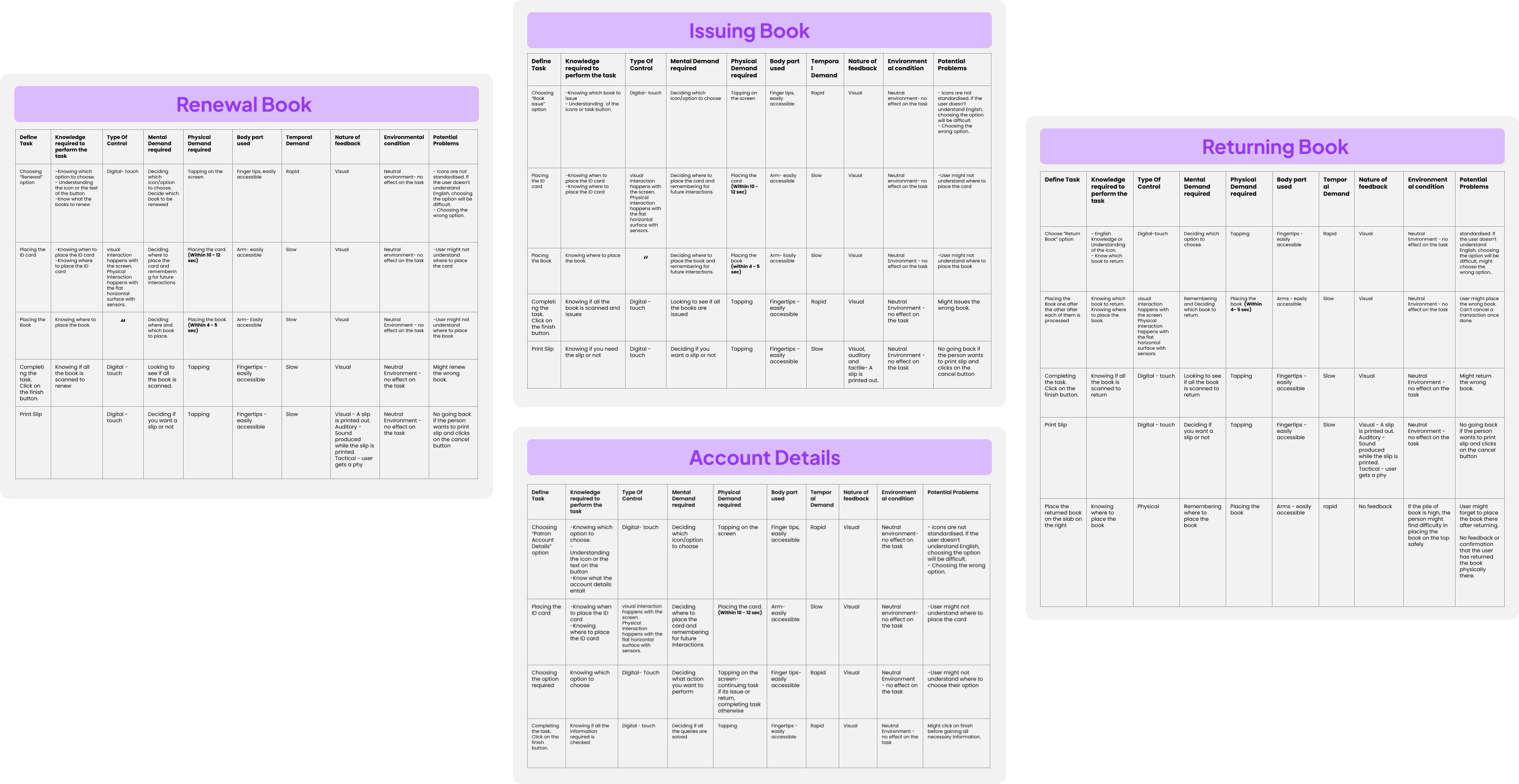
Analysis of each action performed through the kiosk was carried out to understand the required mental model, physical and cognitive requirements of every stage in the process, bodily ergonomics during the execution, environment, and to identify possible problems.

Analysis of each action performed through the kiosk was carried out to understand the required mental model, physical and cognitive requirements of every stage in the process, bodily ergonomics during the execution, environment, and to identify possible problems.

Analysis of each action performed through the kiosk was carried out to understand the required mental model, physical and cognitive requirements of every stage in the process, bodily ergonomics during the execution, environment, and to identify possible problems.

Analysis of each action performed through the kiosk was carried out to understand the required mental model, physical and cognitive requirements of every stage in the process, bodily ergonomics during the execution, environment, and to identify possible problems.

CRUCIAL DECISION MAKING STEPS

  • Deciding which books should be issued/ returned/ renewed.

  • Choosing the correct option- Issue book, return book, extend deadline, account details.

  • Placing ID card- (where to place it- unclear)

  • Placing the book- (where to place it- unclear)

  • Choosing to print slip or not

  • Where to place the book after return

PAIN POINT ANALYSIS OF THE PHYSICAL COMPONENT

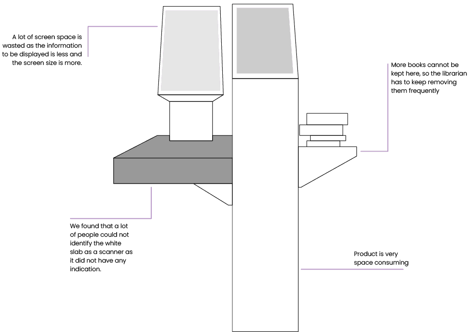
Upon comprehending user requirements, ergonomic factors, and conducting task analysis, we examined the physical body and the user interface to identify areas of discomfort for potential intervention.

Upon comprehending user requirements, ergonomic factors, and conducting task analysis, we examined the physical body and the user interface to identify areas of discomfort for potential intervention.

Upon comprehending user requirements, ergonomic factors, and conducting task analysis, we examined the physical body and the user interface to identify areas of discomfort for potential intervention.

Upon comprehending user requirements, ergonomic factors, and conducting task analysis, we examined the physical body and the user interface to identify areas of discomfort for potential intervention.

Pain points ananlysis of the user interface
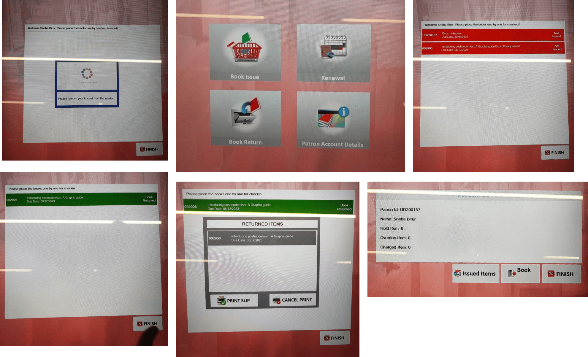
Icon usage

  • Non-standard Icons used.

  • Unrelated icons/ wrong icons used : Finish, Show ID card.


No User control and freedom

  • No option to go back if the user issues/ returns/ renews a wrong book.

  • No option to cancel the process.

  • No option to deselect a scanned book .


Lack of visual hierarchy and different sensory identifiers .

  • Visual identifier as well as the name of book would be a better indicator.

  • An auditory feedback when a book is successfully scanner would be more effective : the user might be distracted when the book is being processed, so if an auditory feedback will bring back their attention.

  • Important message about the next step is not highlighted.
    Ex : “Please place the books one by one
    Inconsistency.

  • Two different words used to indicate the same task.
    Eg : Checking out books and Issue books refers to the same task. Checking in books and return books refers to the same task.

  • Two different icons used to indicate same task.


  • Log out time is less, and if the book in not placed soon there is an error which will add to temporal demand.

  • No mention of what to do with the books after the returning process is done.

IDEATION

objective

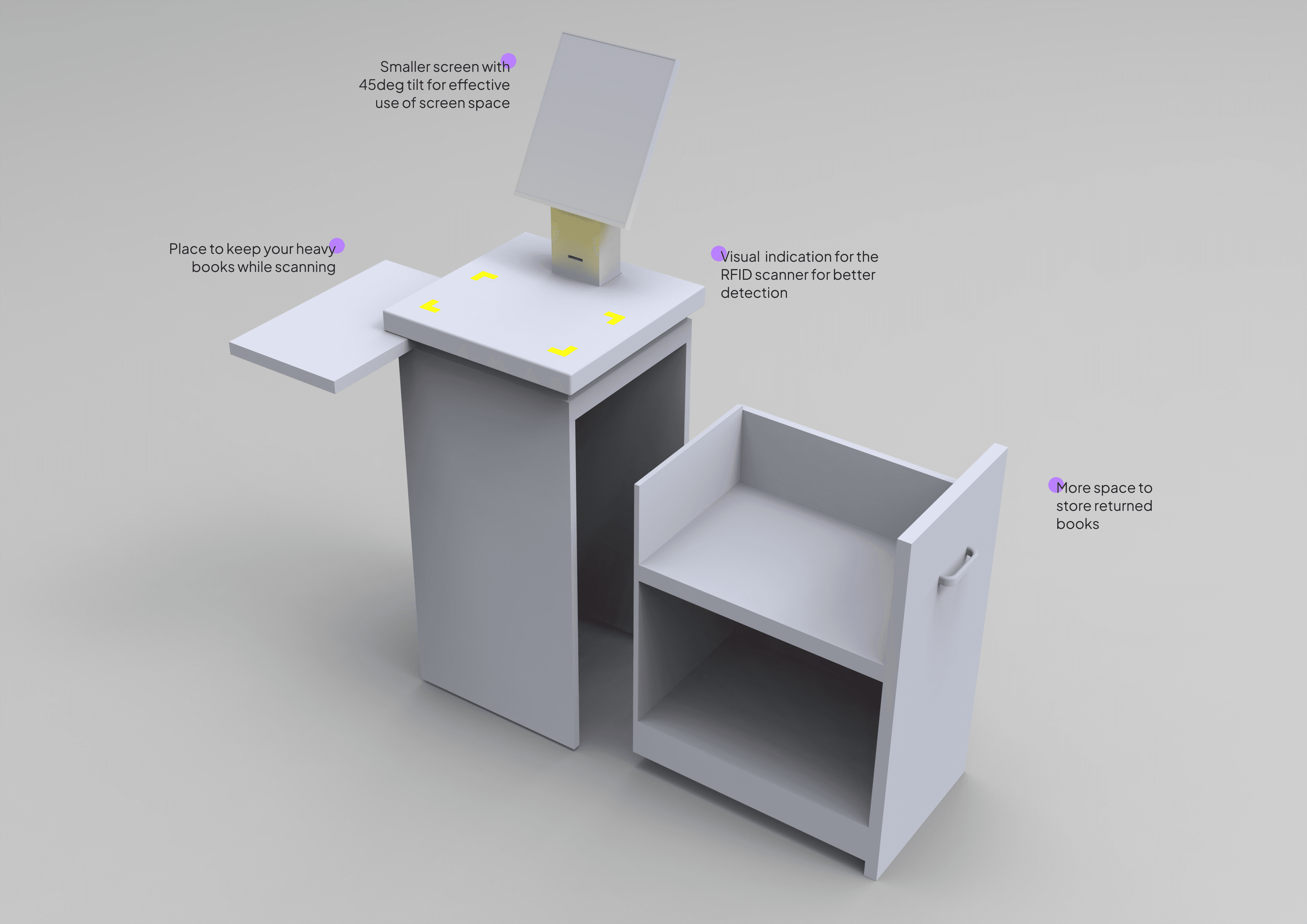
Physical Component

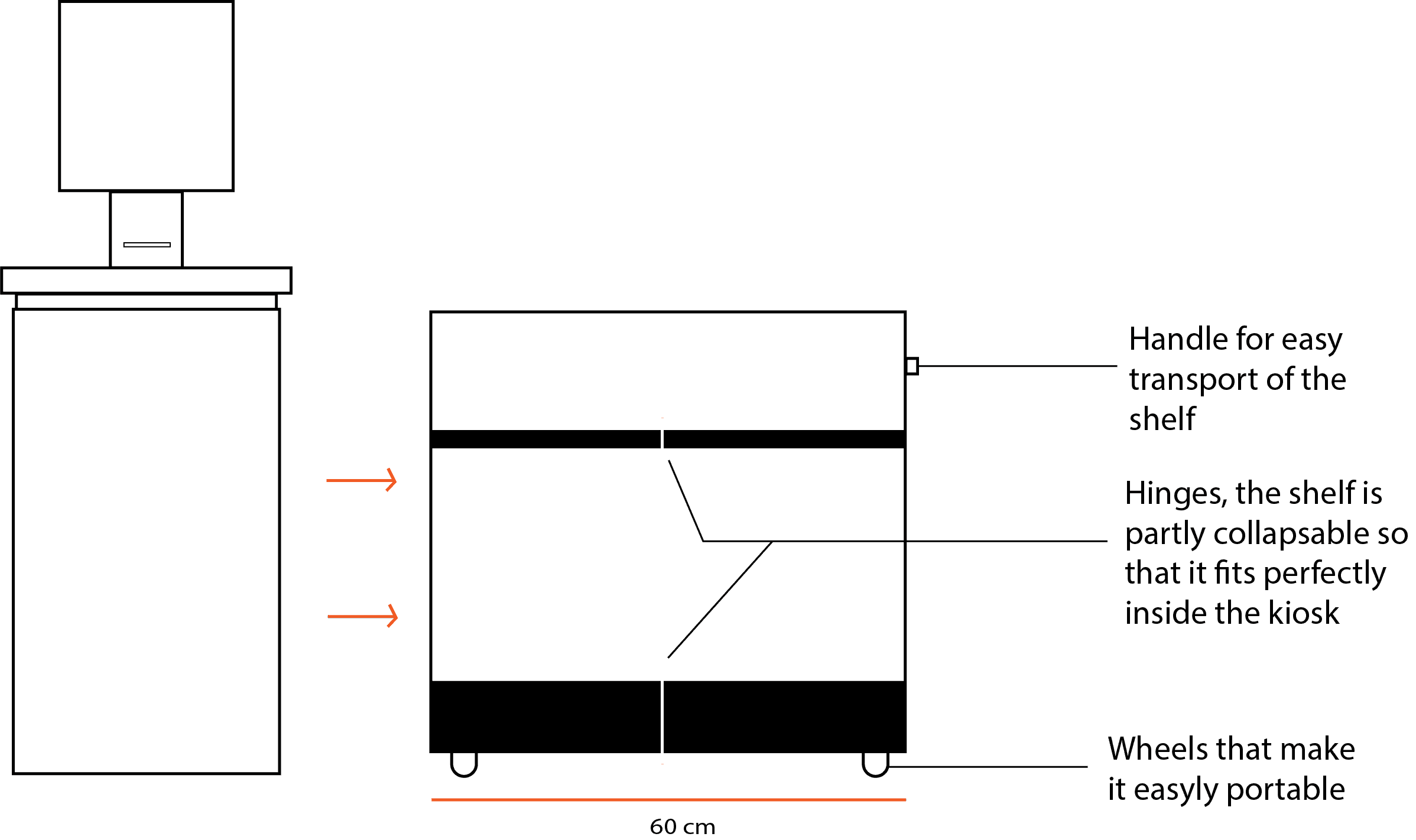
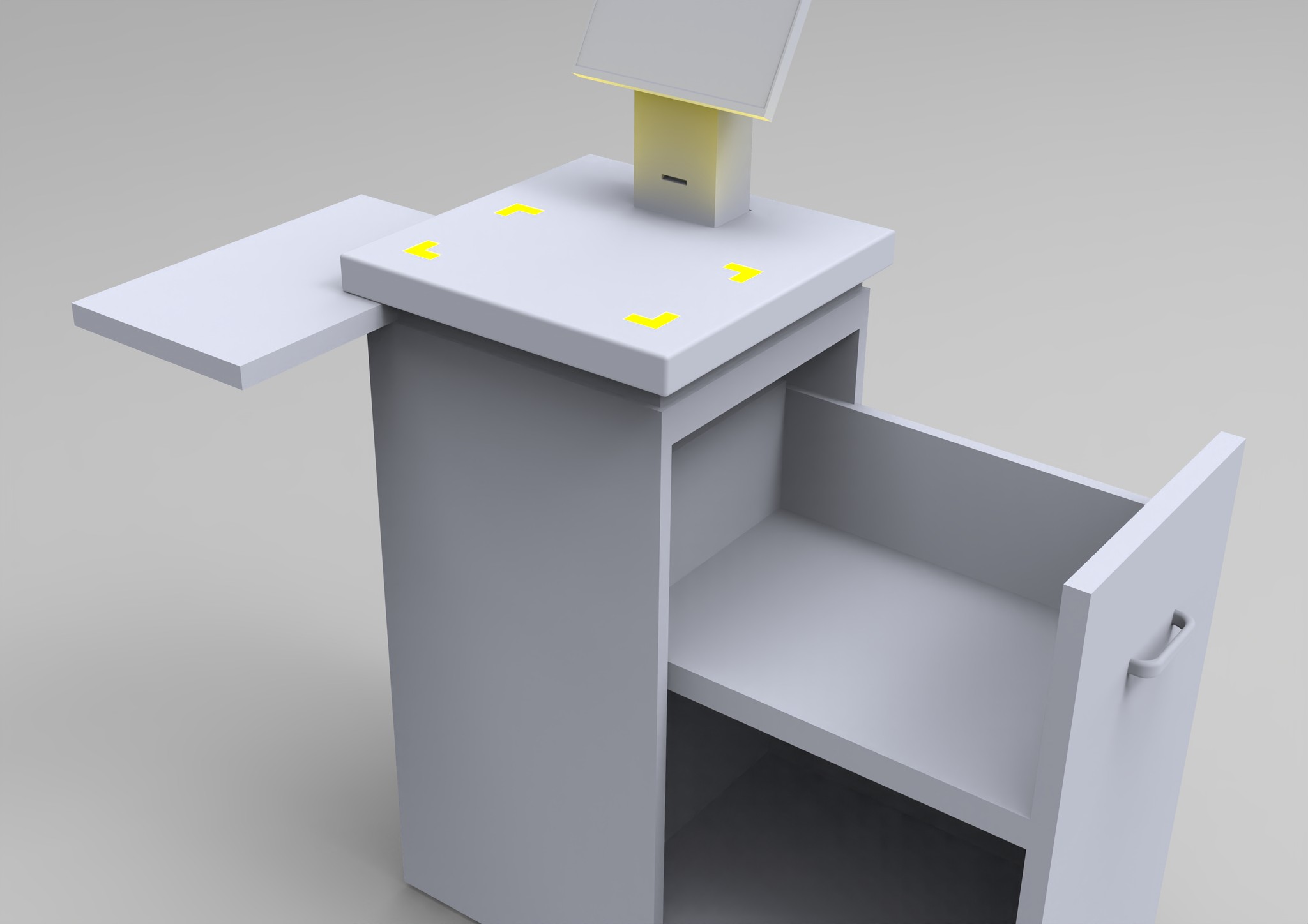
  • Incorporate space to store more books that is returned, to reduce load on the librarian.

  • Use the screen space efficiently.

  • Make the RFID scanner more prominent.


User Interface

  • Use better understandable icons.

  • Increase contrast.

  • Highlight the main information.

  • Give a return option in case of error.

  • Visual, auditory identifiers.

  • Reduce error messages.

  • Use similar language throughout.

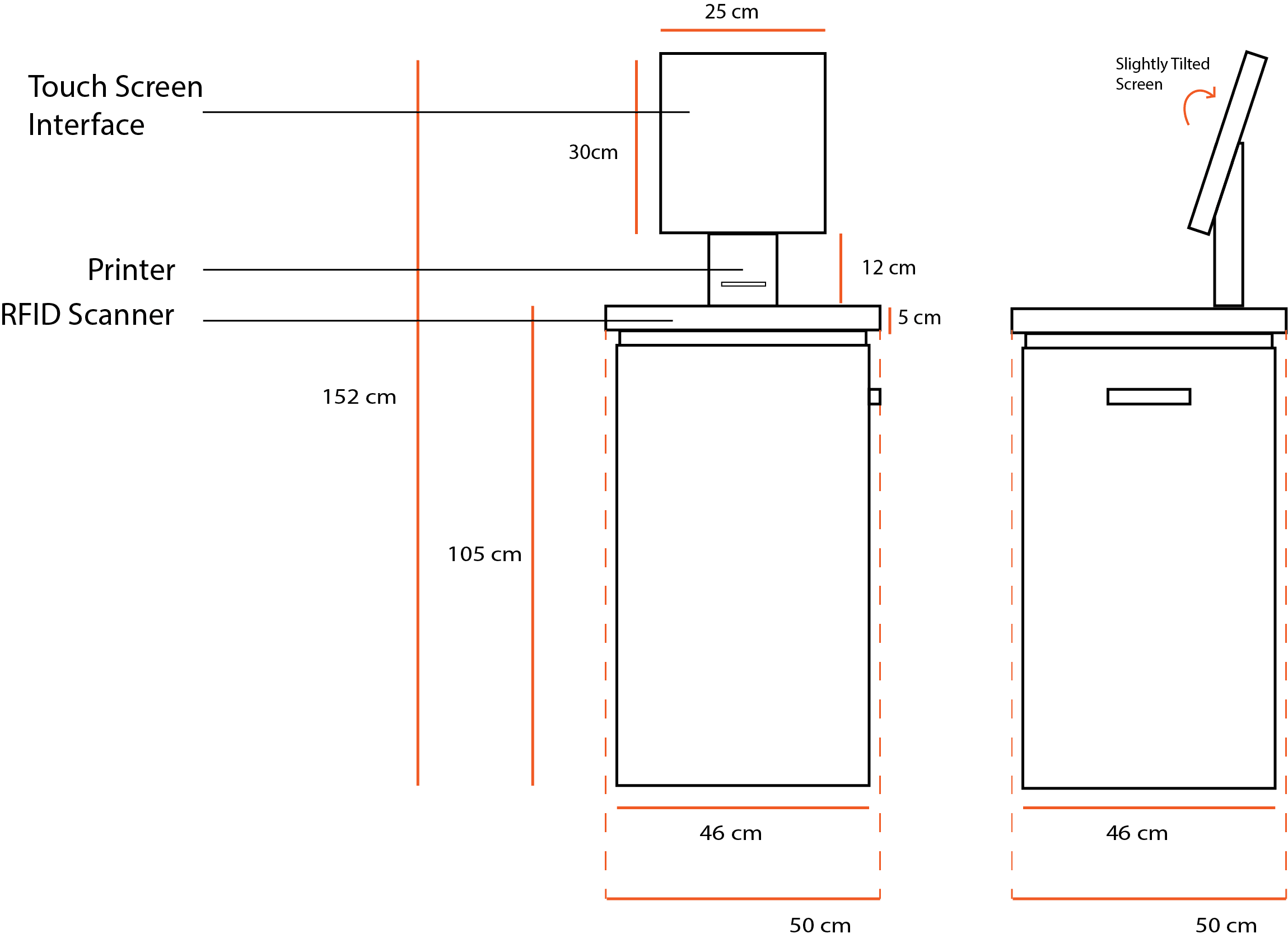
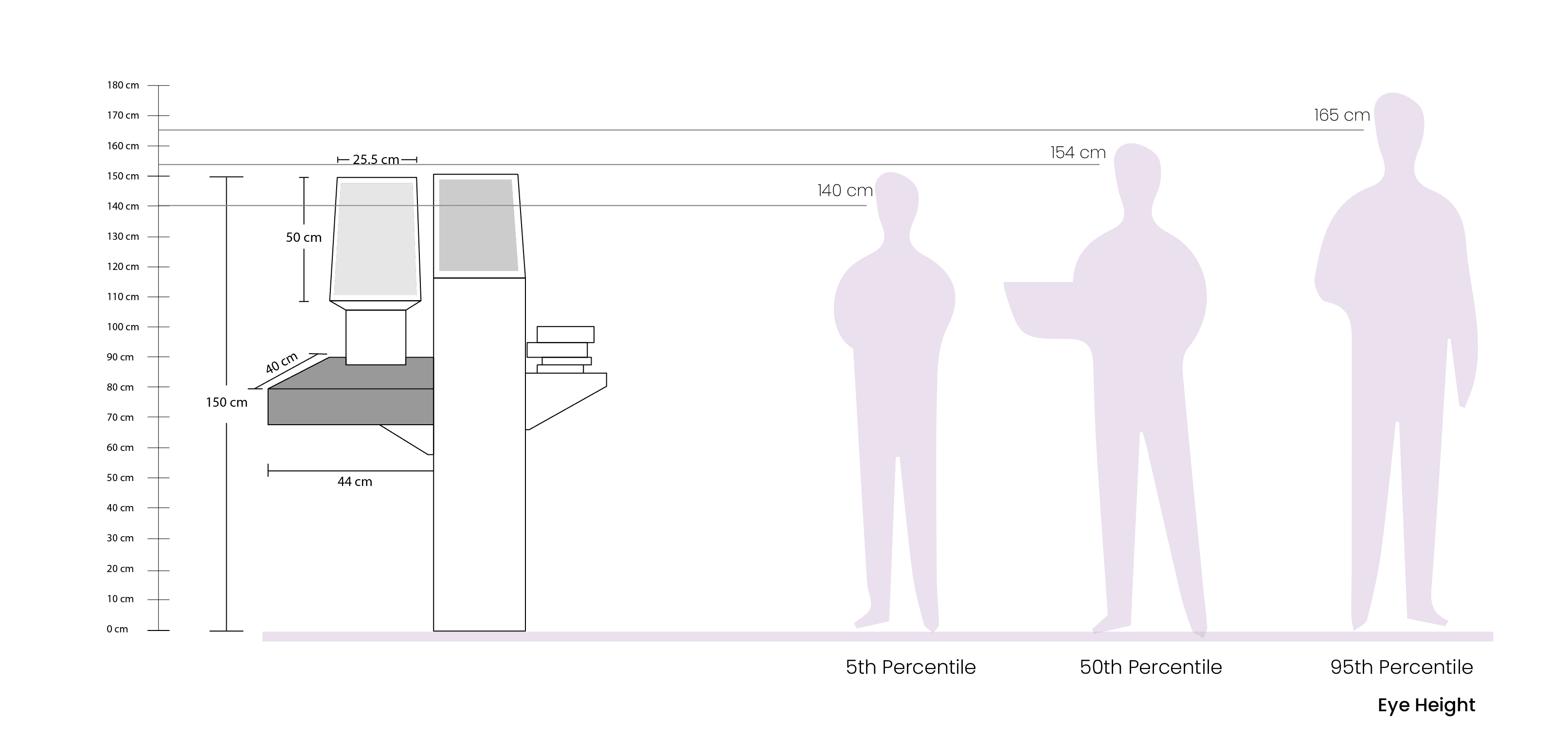
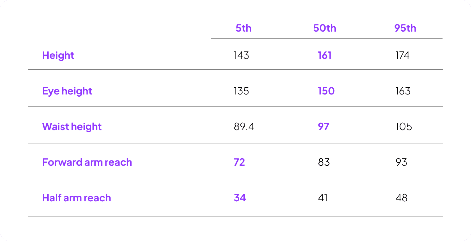
Indian Anthropometric data considered (in cm)

Final Kiosk REDESIGN

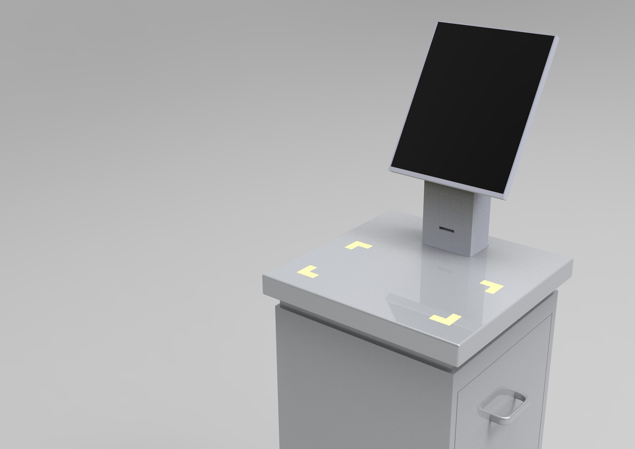
After many rounds of brainstorming one design was finalized that best achieves the goal, which consequently improves the product's user interaction, heightening ease for library staff, and ultimately elevating the comprehensive experience.
USER INTERFACE REDESIGN

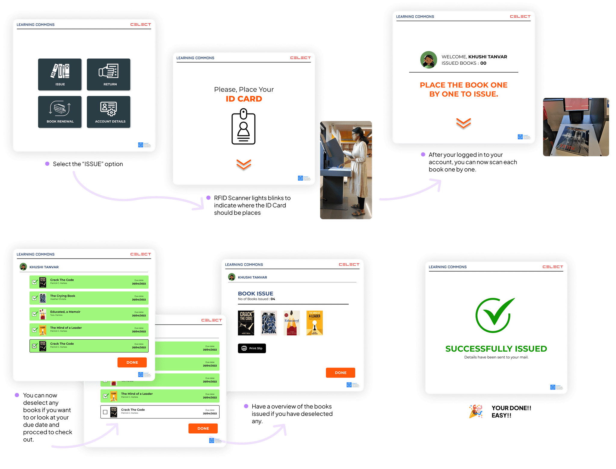
  • The RFID Scanner blinks whenever their is an indication to scan anything

  • The main instruction is now in focus and easily readable with visual aid.

  • Option to go back on a wrong choice made, or deselect if you select the wrong book is there.

  • Incase of a fine the library department does not handle finances therefore, the payment details would be sent via email.

  • Cover of the book is also displayed for better identification and error reduction.
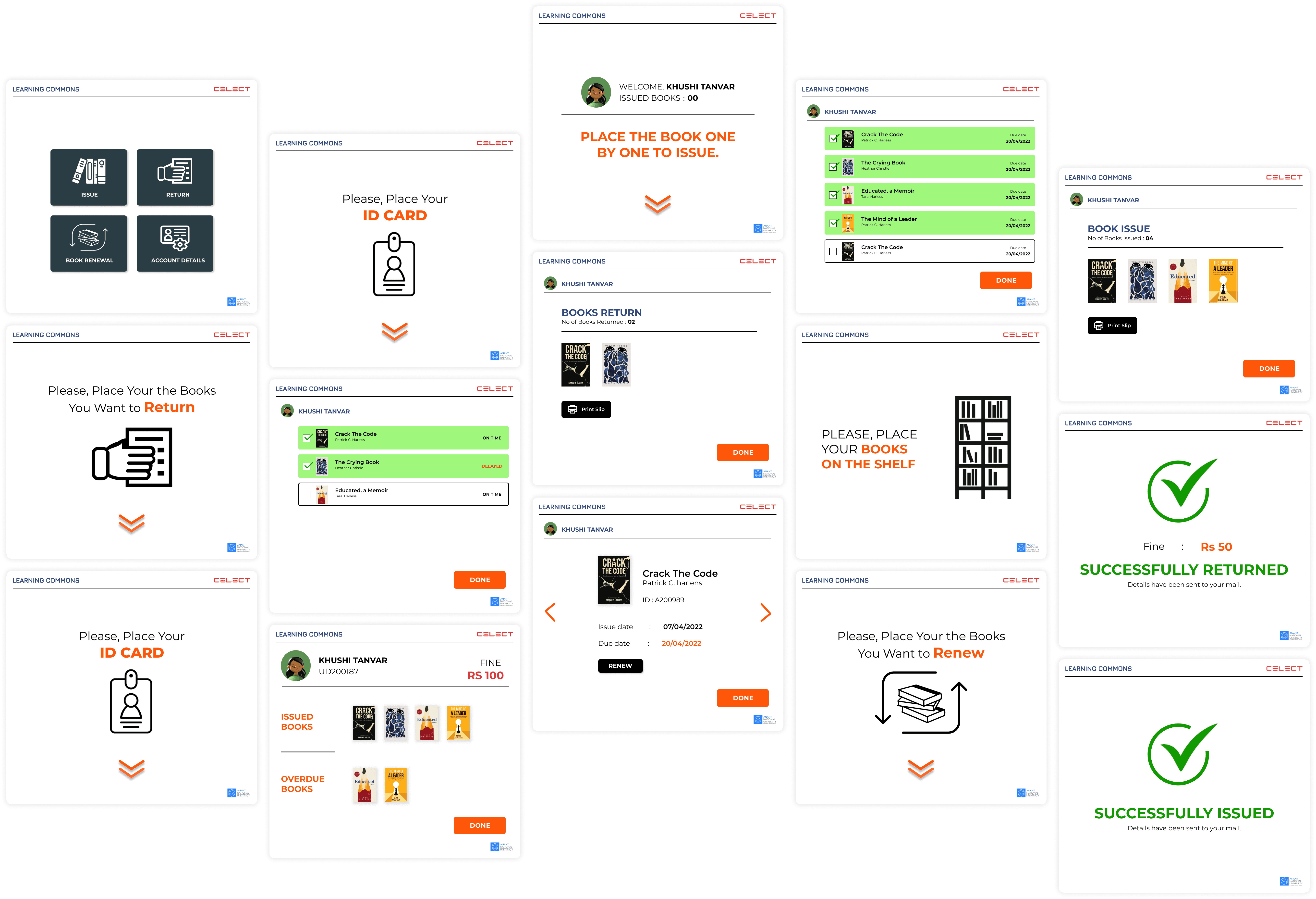
IMPROVED TASK FLOW

The user flow below show how the redesigned kiosk and its interface has made the user experience better.

Click here to try out the prototype.
IMPLEMENTATION

Although altering the physical structure and software design was beyond the scope of the Library Department, they did incorporate several of our suggestions and we implemented the following modifications.

  • A sign was affixed to the RFID Scanner, resembling the lights in our design, to make it easier to identify.

  • Upon realizing that printing was an unnecessary step, the printer was removed to reduce paper expenses.

  • Additionally, a rack was placed beside the kiosk to accommodate more returned books, thus minimizing the librarian's workload.